

Bhinneka, having been serving gadget and computer market for 14 years, is one of the oldest e-commerce site in Indonesia. Since a few years ago it started expanding its wing and became a marketplace for a wide range of products, from travel equipments to baby needs.
As an e-commerce business, website is an important source of revenue. Good website usability means potential customers are more likely to purchase, and existing customers are more likely to visit again and recommend Bhinneka to their friends. So, how is the usability of Bhinneka’s e-commerce site? We conducted a heuristic evaluation on Bhinneka.com to evaluate its usability and overal user experience.
First Impression and Overall Design
Category List
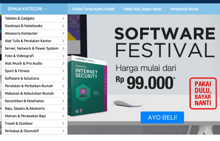
Upon visiting the website, we were greeted by a carousel containing a few running promotions — a common practice in e-commerce websites, even though many doubt the usefulness of carousel in e-commerce sites. Another thing that caught our attention is the list of categories on the left hand side. The category list is long, tedious; the font size and spacing is too small; and it is not obvious how the list is sorted, making it hard to scan through the list and find the desired category/subcategory.
Unclear Separation of Banners
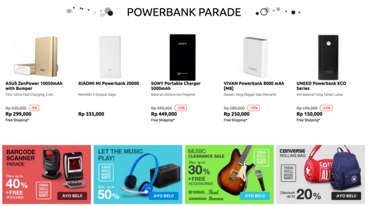
Scrolling down, we saw a rather cluttered placement of product banners. Various product banners (barcode scanner, gadget accessories, musical instruments and travel bags) are placed below ‘Powerbank Parade’ with no clear distinction between sections.
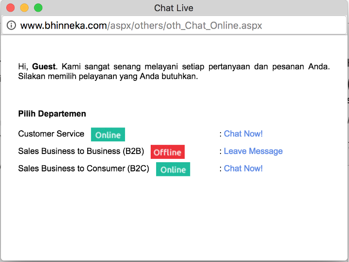
Live Chat
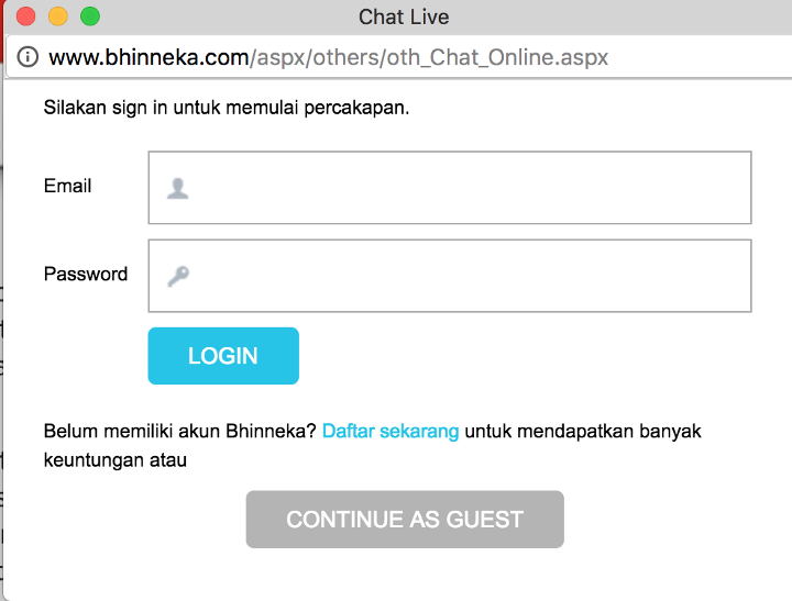
As for the live chat feature, in a glance it looks like it requires users to log in in order to use it. If live chat is aimed to make sure that the customers’ problem is addressed as quickly as possible, logging in would add up time and introduce extra barrier for customers to get answers that they need. Customers can, in fact, chat as a guest, but the button looks like it is disabled — thus hindering customers to use it.
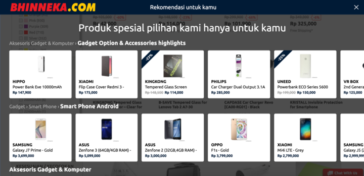
Product Recommendation
While product recommendation is a great way to increase revenue from sales and improve customer retention, the product recommendation feature at Bhinneka.com floats and pops up from the bottom of the page, which is annoying as it covers and distracts users from reading the page content.
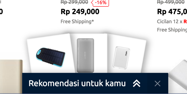
In addition, when clicked, the recommendation covers the whole page showcasing arrays of different products, which is overwhelming. It feels like browsing and searching amongst multiple products again instead of a curated recommended list that are very relevant to the user’s needs.
Terminology
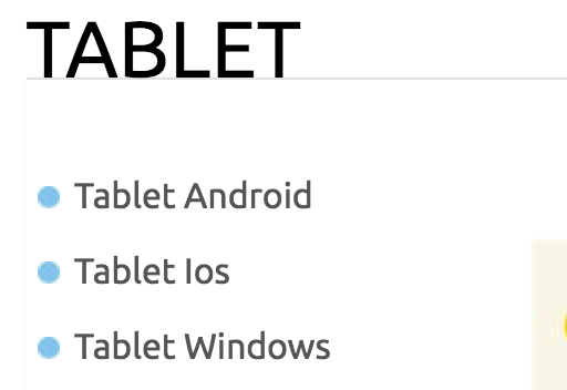
We noticed several incorrect use of uppercase/lowercase letters in some products, such as ‘Ios’, and ‘Iphone’. It can be confusing for some people, and if Bhinneka doesn’t even know how to write the name of the products accurately, how can they expect the users trust them? For all we know, users can even doubt the originality of the products. Beside that, on Tablet category, they name one of subcategory ‘Tablet Ios’. Since the only tablet that uses iOS is iPads, why don’t just name the subcategory ‘iPads’?
Category Page
Product Comparison Feature
Now we’re moving on to Category page. Bhinneka has put an excellent initiative in improving the shopping experience by providing a product comparison feature. Unfortunately it doesn’t come with good usability for a number of reasons. Firstly, after adding a product to compare suddenly a white box appears, floating on the top of the page with no clear separation with the content area. The white box only contains the products that we want to compare, with no title implying what it is, nor a clear call-to-action. We had quite a hard time finding the button to compare.
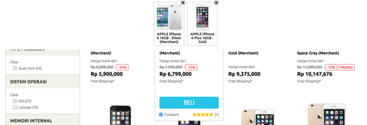
Secondly, it is really difficult to change the products that we want to compare when we are in the Product Comparison page. We have to go back, change the products, and click Compare again. Also, there is no simple way to add similar products to the comparison page.
And lastly, there is no way to share the product comparison to other people, in case they are looking for a second opinion. Usually people do it by sharing the URL, but for Bhinneka website, the URL does not reflect the content of product comparison.
Filter
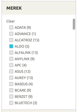
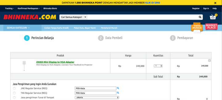
Filtering, or the ability to narrow down a range of products to match customer’s’ particular needs and interests is an essential aspect of an e-commerce product browsing experience. Bhinneka has implemented this feature with various filter categories such as color, brands, and others. However, when clicking on a filter, a new page loads and the website scrolls all the way to the top. It is quite inconvenient to having to scroll down to see the result again.
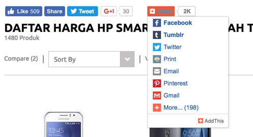
Social Buttons
Currently on top of any category, Bhinneka shows the number of likes and +1 a category a product has. We are not sure what is the benefit of this to help potential customers. We tried the feature, but it is not reflected on our Facebook/Google account after liking/giving it a +1. Maybe a ‘wishlist’ feature would be more helpful instead of these share buttons.
Also, there’s a redundancy on Facebook share & tweet on Twitter buttons.
Product Page
Lack of Review
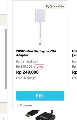
When we first opened Bhinneka, we had a goal in mind: to buy a new mini displayport to VGA for our Early 2015 MacBook Pros. There were many options from various brands and with various prices. We have no experience in buying mini displayports and no clue about which brand to choose. Usually we opt for a product with the best review and rating. But there is very few products that have rating, let alone review in Bhinneka’s website. Such reviews would be really useful to help customers make decision and convert, especially for those who don’t have much experience in product they are buying.
Cart
When we clicked ‘Beli’ (Add to Cart) on a product, we had to refresh the page for it to reflect on the cart indication on the top right of the page.
Also users can click ‘Beli’ multiple times, yet the quantity on the cart is not added.
Imagine if users have browsed multiple products, it would be hard for them to differentiate between the once they have added to cart versus those that have not yet added.
Reflecting an accurate status on the button, such as ‘Added to Cart’ would provide better cue.
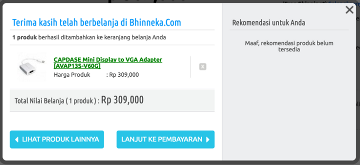
After adding a product to cart, the system supposedly shows a popup that contains product recommendations. But when there’s no product recommendation for us (we assume it’s because we are not logged in), system only shows a message ‘Sorry, product recommendation is not available’. The error message is not useful because it does not indicate the problem precisely, and does not constructively suggest a solution.
Checkout Process
- Header and Footer Links are Still Shown in Checkout Form
Continuing to checkout, the first thing that we noticed is that in the checkout form, the header and footer are still shown. This is not very effective for conversion, as it can lead to abandonment from user. Also since there are many distractions and clutter, the main Call-to-Action button is easy to miss.
- Shopping Details & Shipping Method
Continuing to checkout, we are given a form for shipping method. Choosing the shipping method is really quite a pain. To use JNE, we have to know specifically our area. And to use Free Shipping, we have to make sure the address on our account is a Jakarta address (so if you still have that outside-Jakarta address from previous order, bummer, you have to change your address first in your profile page).
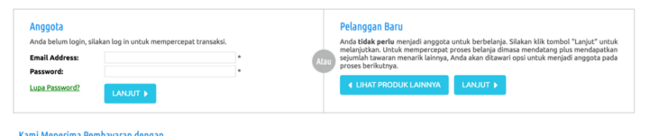
After filling the shipping method, non-logged in guests can go back to browsing products while existing members appear to have no choice but to log in first.
- Customer Details
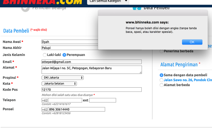
There are several form UX best practices that the customer detail form violates. Firstly, the form does not prevent user from errors by not giving inline guides. Secondly, the error message is shown through a pop up message. It does not help users to resolve the problem as users might not realise which field is causing the error. Thirdly labels are left-aligned. In most cases, when placing labels to the left of input fields, using left-aligned labels imposes a heavy cognitive workload on users. Lastly, the length of the postcode and phone number fields does not provide good affordance / hint as to what would be the appropriate input length.
- Payment Form
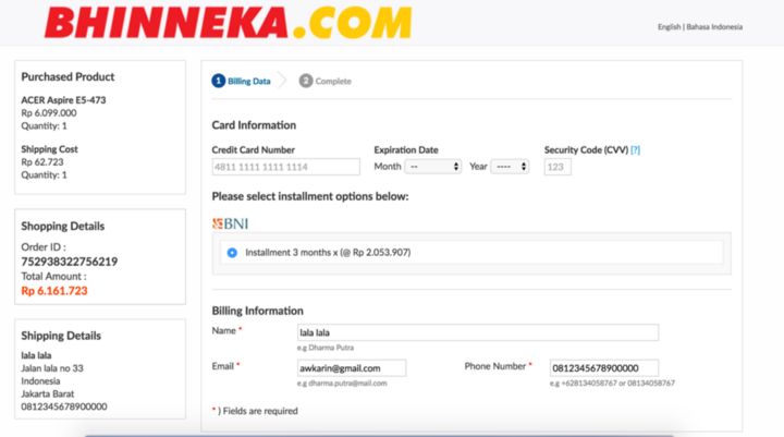
Advancing to the next step: payment. We tried payment by credit card, and the site redirected us to another form that looks different than the rest of the form. This may cause users to wonder if they are still on the same process; it risks causing confusion and alienation.
And when we decided to change the payment method and go back to the Bhinneka website, the whole checkout process was gone and it showed that the cart was empty. All the effort for selecting the product went to drain! As users may change their mind or made an error, it is important to supporting change of payment method in ecommerce, and allow them to recover from such error.
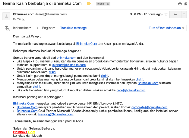
After Sales Service: Return and Refund Process
After completed our order of mini displayport to VGA and waited for 2 days, our order was successfully delivered to the office. We were satisfied with the speed of shipment and quality of packaging but unfortunately not with the quality of the product. It doesn’t work as expected with our MacBook Pro and LCD monitors. So we decided to contact the customer service for return and refund. We opted for online support because we wanted to send them pictures explaining why the product doesn’t work.
Attempt 1: Live Chat
We tried using the live chat as a guest to contact the customer service, as this method seems like the fastest and most convenient way to reach them.
But with no luck because the chat window always says ‘please wait, we are connecting you with an agent’ for about 15 minutes.
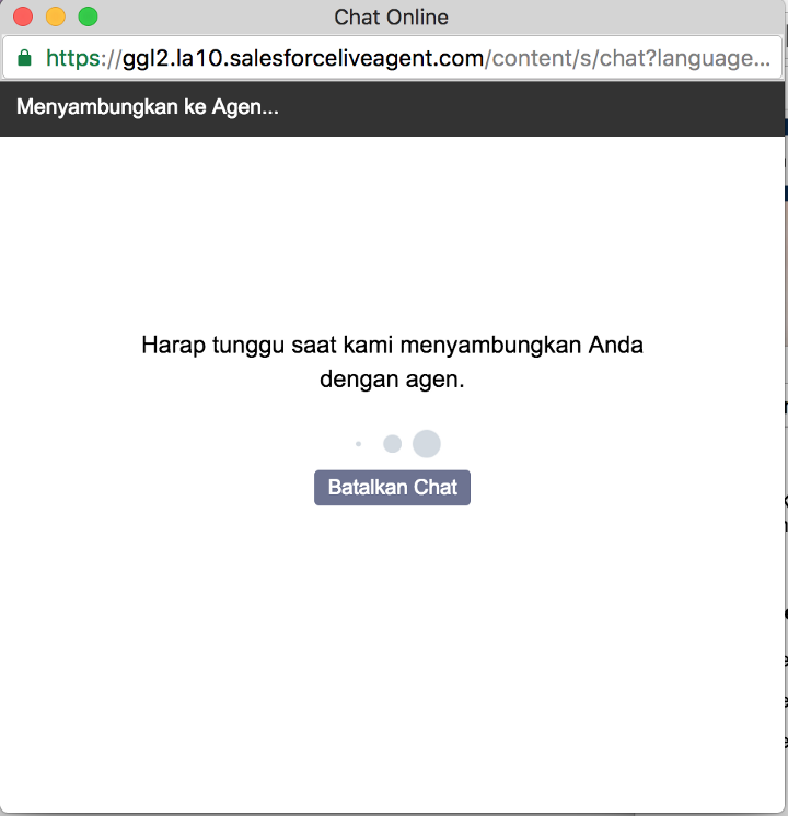
So we decided to find another way to contact them.
Attempt 2: Contact Form
Because we ordered using a registered account, we tried logging into the account to see if there is any return & refund form on our transaction history list, some kind of a follow-up.
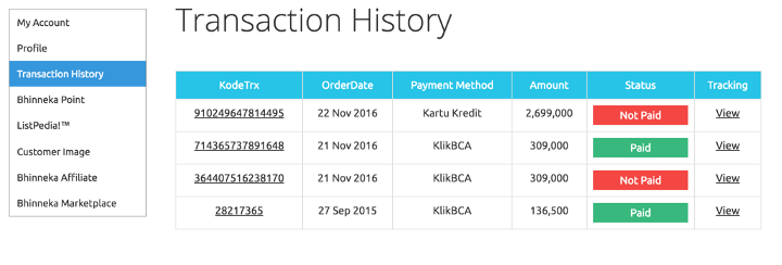
O-ow! There is nothing about return and refund on our transaction history list.
Attempt 3: Return & Refund Form on Email
We almost gave up and resorted to call Bhinneka directly, but we remembered about the email Bhinneka sent after the product was shipped.
So we clicked on the option that says ‘for unit replacement because of defect/not working/wrong item shipped, you can report to our customer service here’. The link led us to this form:
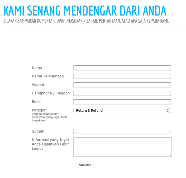
Apparently we have to fill our personal data all over again for return & refund request. This is highly inconvenient and can potentially lead to the customer to churn and stop shopping at Bhinneka again.
Recap
From what we have listed above, it is clear that there are still a lot of rooms for improvement for the Bhinneka website. These are the key points that summarize the issues we identified:
First Impression and Overall Design
- Ineffective carousel on homepage
- Category list on the homepage is hard to read
- No clear separation of banners on homepage
- False affordance in live chat feature
- Inaccurate use of uppercase/lowercase letters and product naming
Category Page
- Product comparison feature needs a lot of improvement
- Filtering issue
- Social buttons need revisit
Product Page
- Lack of product reviews
- Cart does not work as expected
Checkout Process
- Header and footer links are shown on the checkout form
- Difficult to choose shipping method
- Customer details form does not adhere to form UX best practices
- Payment form look and feel is inconsistent with the rest of the checkout forms
- Loss of all purchase and customer data after going back on payment form
We hope you find this review useful. If you have any question, please reach out to us!